-05.png)
New Feature: Kit Builder Now Displays Kit Components on Product, Cart & Checkout Pages

Ray
AnvaSoft E-commerce TeamYou asked, and we listened. Kit Builder now lets store owners display kit components directly on the product, cart, and checkout pages - fully configurable with CSS injection controls and no theme edits required.
You asked, and we listened. The Components Display feature has been one of the most consistently requested additions to Kit Builder - and it is now live. Store owners can show customers exactly what is inside every kit, right where it matters most: the product page, the cart, and checkout.
Why This Feature Matters
Customers buying a kit want to know what they are getting before they commit. Without a visible component list, they either abandon the purchase or flood your support inbox with questions. Components Display solves both problems by surfacing kit contents inline - no extra clicks, no separate documentation to maintain.
"This was the single most-requested feature from Kit Builder merchants over the past year. We heard you, and we built it the right way - fully configurable so it fits any theme without touching theme files."
AnvaSoft Development Team
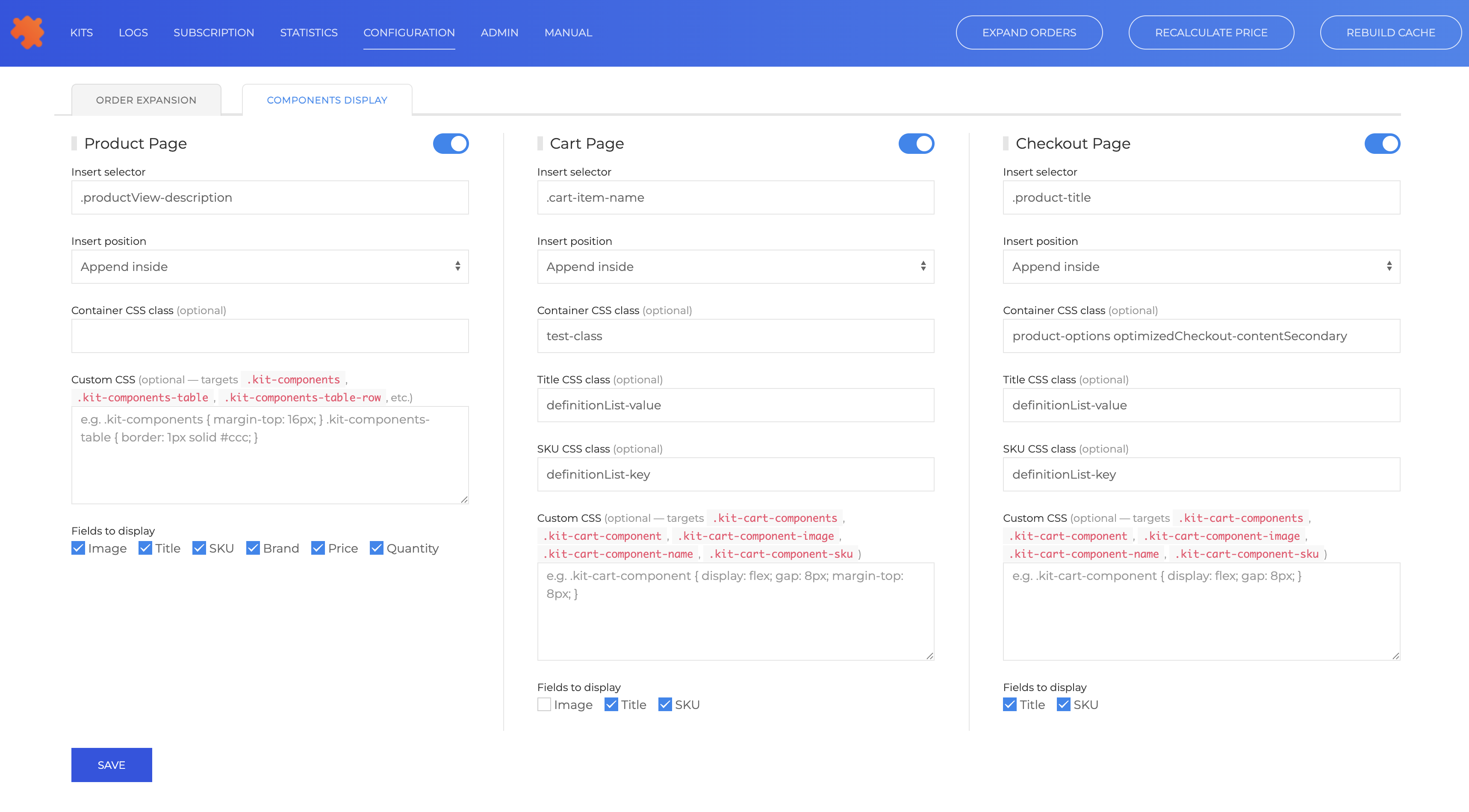
Enable Components Display Per Page
The new Components Display tab in Kit Builder Configuration gives you independent control over three surfaces. Each one has its own toggle so you can enable exactly where the component list appears and leave the rest untouched.
- Product Page - show the full component list alongside the product description before the customer adds to cart
- Cart Page - remind customers what is in their kit while they review their order
- Checkout Page - display components at the final step to reduce doubt and lower abandonment
Precise Injection Control
Every page surface lets you specify exactly where the component list is rendered. Set an Insert Selector - any valid CSS selector that targets an existing element in your theme - and choose an Insert Position such as Append Inside, Before element or After element. This means you can place the component list directly below the product title, inside the cart item row, or alongside the order summary at checkout, all without editing a single theme file.
Full Style Customisation
Components Display ships with sensible defaults, but every visual detail is yours to control. Each page surface accepts a Container CSS Class, a Title CSS Class, and a SKU CSS Class, letting you apply your theme's existing utility classes directly to the component list elements. For deeper customisation, a Custom CSS field targets the dedicated Kit Builder class names - .kit-components, .kit-components-table, .kit-components-table-row on the product page, and .kit-cart-components, .kit-cart-component, .kit-cart-component-image, .kit-cart-component-name, .kit-cart-component-sku on the cart and checkout - so you can write precise, scoped styles without affecting the rest of your storefront.
Choose Which Fields to Display
Not every store needs the same information. The Fields to Display checkboxes let you pick exactly what appears in the component list for each page. The product page supports Image, Title, SKU, Brand, Price, and Quantity. Cart and checkout surfaces offer a focused subset - Title and SKU by default - keeping the experience clean at the later stages of the buying journey.
Available Now
Components Display is available immediately for all active Kit Builder subscribers. Open Configuration in your Kit Builder dashboard, navigate to the Components Display tab, and enable the surfaces that make sense for your store. No theme edits required.